3 disaster recovery tools to transform your DR plan
We talk a lot about how we strive to add value to the organisations we work with. But rather than just telling you about the value we can add, we like to prove it wherever we can.
Our latest suite of tools is specifically designed to help with your disaster recovery planning. In my experience, most IT teams tend to think about disaster recovery purely in terms of the technologies they use. We tend to think "how quickly can I recover or where would I source a replacement for this piece of hardware?". The problem with this perspective is that if we're just thinking about the technology itself, we're not always focussed on the business services that technology is supporting. Now, it's time to look beyond the tech to the processes behind it all to make sure your DR is actually working to achieve your real recovery needs.
The IT Resilience Maturity Model (ITRMM)
The ITRMM helps to identify the things you need to know before you start your disaster recovery project or talk to a DR service provider. The aim is to start thinking about disaster recovery, and the all the factors that affect it, in a way that you might not normally think about it. There is a market full of services to help you with your business continuity but there is no point spending money on a problem that you don't have – so working out where your strengths and weaknesses lie is crucial.
Over the course of 10 questions (based on ISO22301, the International Standard for business continuity management) the ITRMM measures the standard of existing technologies and processes that plug into your wider business continuity plan.
The tool then models your responses on a radial chart, like the one below. You can also then compare your maturity rating with a sample of model responses from peers, SMEs and organisations in highly regulated industries.

The Risk Register and Matrix
A Risk Register is something that will be familiar to any organisation that certificates to ISO 9001 for quality management, but not many organisations will put this information into a matrix without the help of BCM software. We find that most small businesses tend to keep the Risk Register in a simple list format.
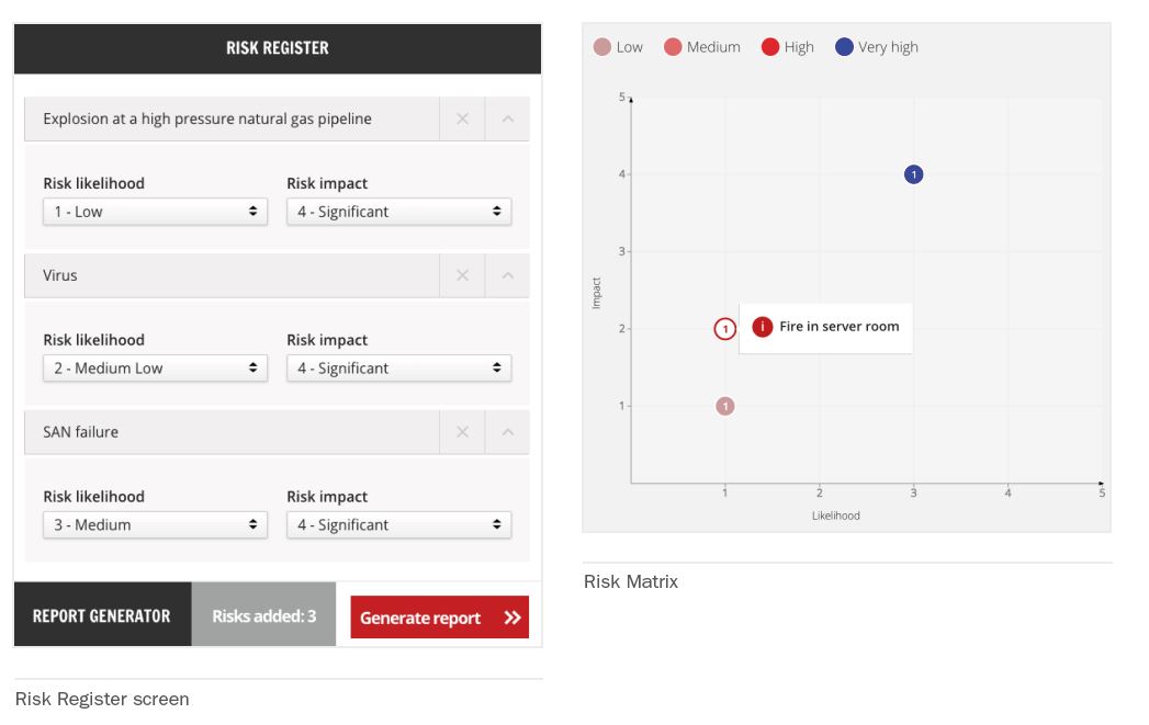
Using the London Risk Register as its basis, the Risk Register & Matrix asks you to select all of the environmental and IT risks they face, and score them according to severity and likelihood. There is a bank of suggested risks to choose from, although we encourage you to use your own.
The tool then maps the risks onto the Risk Matrix. The number on each point of the graph indicates how many risks share the same severity/likelihood value – simply mouse over each point to see the risks that occupy that space.
Using a matrix makes it easier to have conversations with rest of business – it's much more visual than just a list with corresponding numbers, which makes it easier for other stakeholders in the business to consume and understand. Disaster recovery and business continuity need agreement across departments and from the senior business leadership so good communication between all parties and simplifying difficult concepts is vital to having a successful plan.
One final point to mention on the Risk Register is that it's something you should be updating regularly as your risks change and evolve. Imagine how much more likely or severe you would estimate a cyber-attack to be now as opposed to 5 years ago, for example.
The Technology Dependency Map
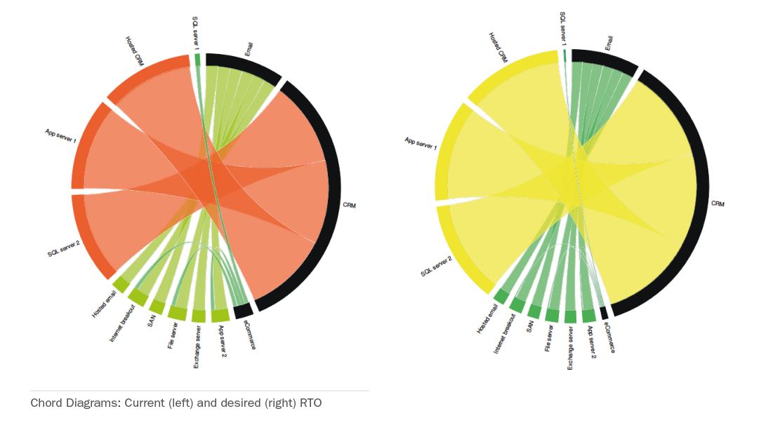
The Technology Dependency Map is the most complex of the tools, but it also delivers the greatest value, in the form of a gap analysis between current and desired RTOs and RPOs for specific services. It helps to untangle your IT dependencies, and displays them in a way that you might not normally think about them – looking at the gap between where you are now and where you want to be.
The tool asks you to list your most critical IT services and attach all the associated assets to them. Next, you can assign the current and desired RTO and RPO for each service. The reports then present you with chord diagrams that display the connections between assets and services. Both the colour and the width of the connections refer to the stated recovery time – thin dark green for instant and thick orange and red for up to a week (see the example below).
The result is that you can look at each IT service that you deliver to the business, and work backwards to the recovery objectives for your assets.
We created these tools not only to help with finding and plugging the gaps within your business continuity plans, but also to put the results into very visual, actionable reports that makes the conversations about DR with the rest of the business much easier. For smaller organisations who don't have an in-house Business Continuity Management team, that can be tricky – especially without the budget for consultants or specialised BCM software – but we think it should be something that's accessible to all organisation, regardless of budget.
To try the tools out yourself, just go to http://tools.databarracks.com.

